
Lookout app
An app for vision impaired people where they can scan their environment and the app would announce the recognized text and objects out loud.
I led the end-to-end redesign + new features + launched the app globally
Platform: Android Mobile + Tablet
Team: 2 Designers, 1 Researcher, 4 Engineers, 2 PM
Duartion: Aug 2022 - Sept 2023
UI + UX Design
Prototyping
Visual + Animation
The Problem
Lookout struggled with adoption rate!
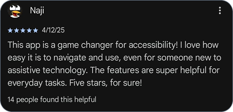
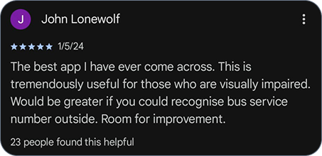
Becasue on functionality and marketing, Lookout was perceived as a tool for only blind people.
Vision Impairment isn’t binary, “can see” or “can’t see", it is a spectrum of visual abilities.
Normal vision
Black Spots
Central Loss
Peripheral Loss
Cloudy Vision
Legally Blind

The Solution
1. Google family
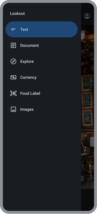
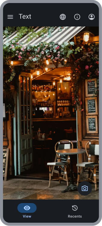
Building trust by migrating Lookout to Google's Material 3 design system
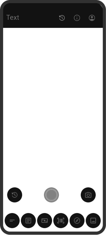
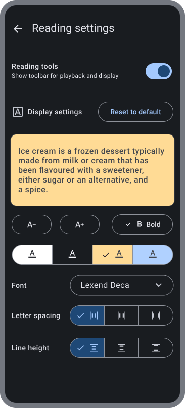
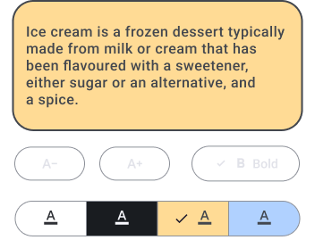
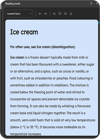
2. Reading tools
Increasing support by enchancing reading ability for Blind & Low-Vision people.
3. Generative AI
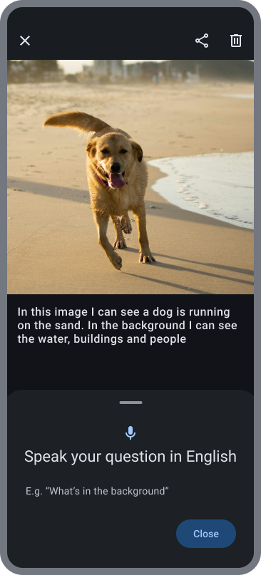
Helping understand images by generating captions and answering questions regarding it
Identifying Gaps
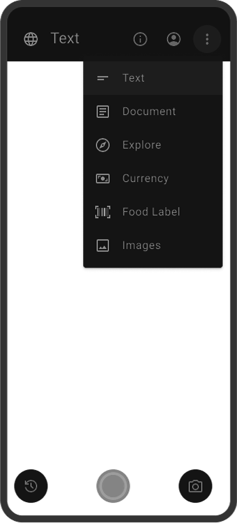
Analyzing previous design of Lookout to identify any issues or concerns.
Explorations
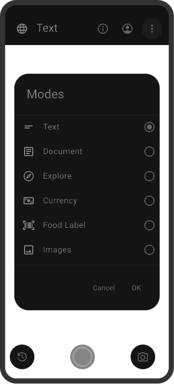
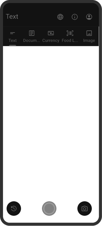
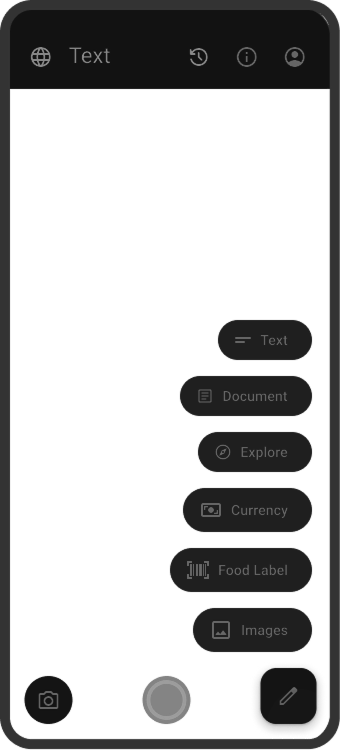
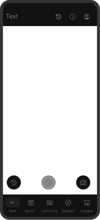


Final Designs
Rationale
The redesign of the Lookout app was based on solid foundation and rarionale
Reading Tools
Enhance reading experience for blind and low-vision users, reading content aloud and personalize the display content.
Image Q&A
Provides AI-generated caption for an image, and conversational flow to give contextual information regarding the image.
Challenges
PM & Engineering team did not consider the onboarding user to the changes to the app layout. Eventually, team agreed to add 1 screen.
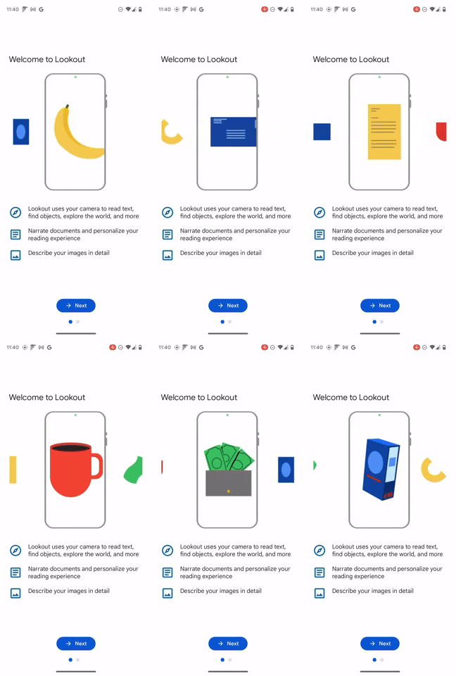
Welcome Screen
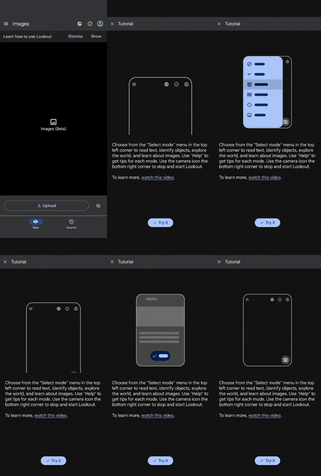
Layout Redesign Tutorial
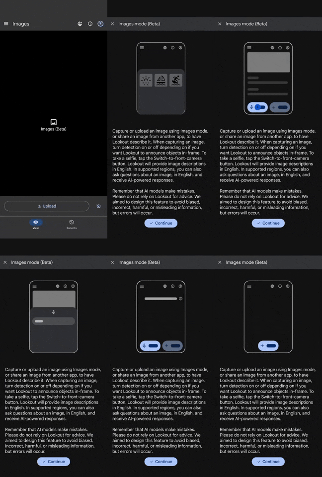
Images Tutorial
Impact
40% increase
in Monthly Active User
42% increase
in Daily Active User
Lookout served as playground for DeepMind’s Gemini Gen-AI conversational flow
Reading tools adopted by Chrome
Increase in Customer Statisfaction
